MARGARITA Rebranding
Logotype, Rebranding, Corporate & Visual Identity
The briefing:
MARGARITA Rebranding
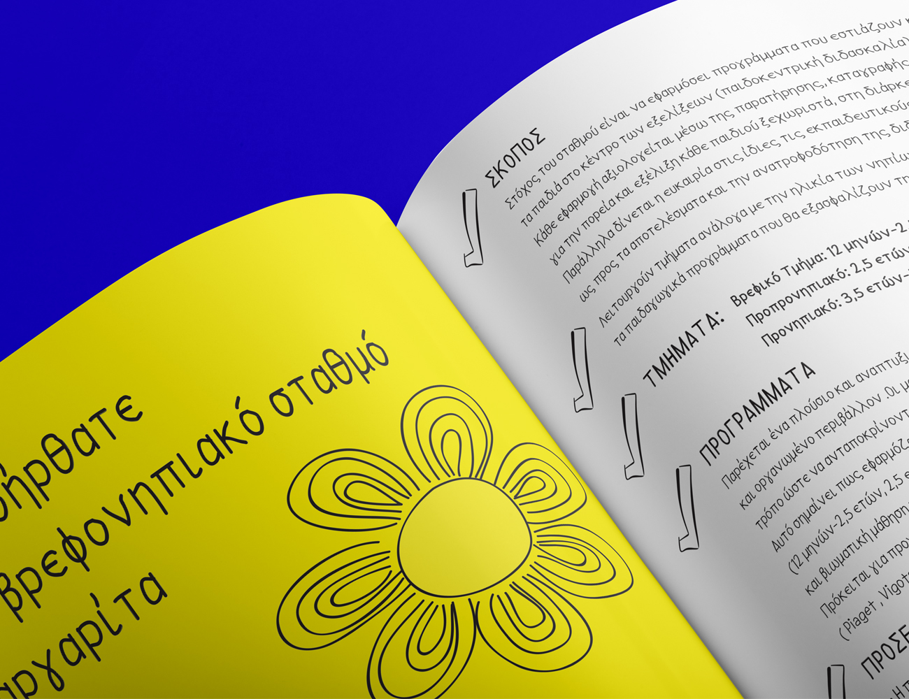
Margarita School offers a friendly, clean, comfortable and safe environment for the children. The nursery school had the need to define its identity and assigned to our office the design of the logo, as well as the corporate image of the school.
The logo is inspired by the name of the school, Margarita which means daisy the flower, while the font is in simple and clean lines.
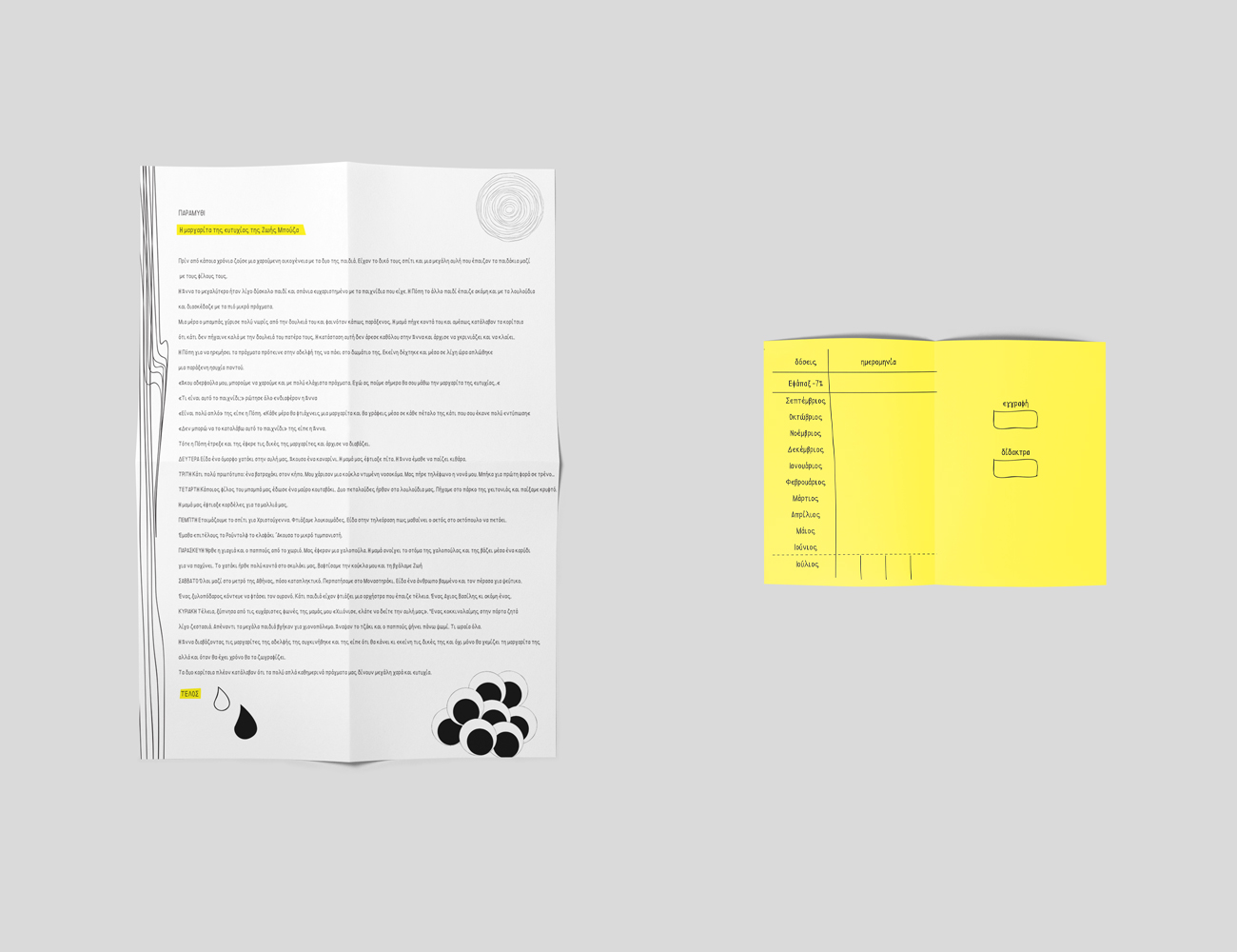
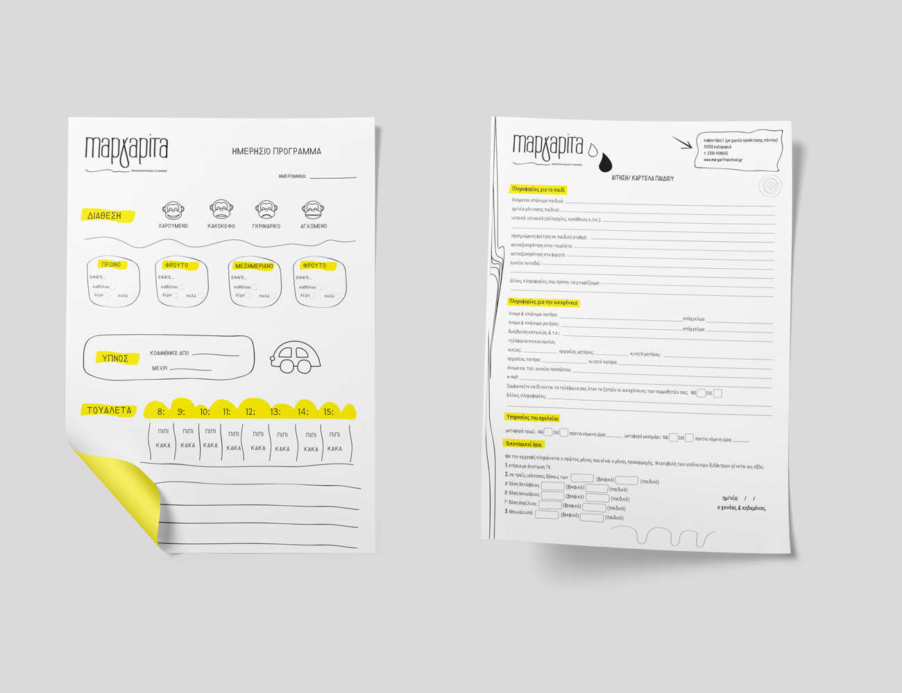
The whole corporate identity was based on the style of the manuscript, like a child's drawing. From the kid's card to the interior graphics, the whole design evokes a more friendly, pleasant and childish atmosphere.
-

Margarita Business Card
-

Margarita Flyer
-

Margarita Folder Design
-