MINI FEE Rebranding
Rebranding, Logotype, Web Design, Packaging
The briefing:
MINI FEE Rebranding
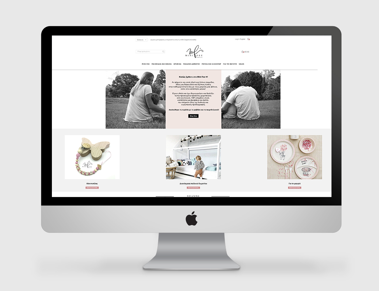
Mini Fee is an e-shop that creates unique handmade products for all mums, dads, kids and anyone else. We were asked to redesign the logo of the company and the web page.
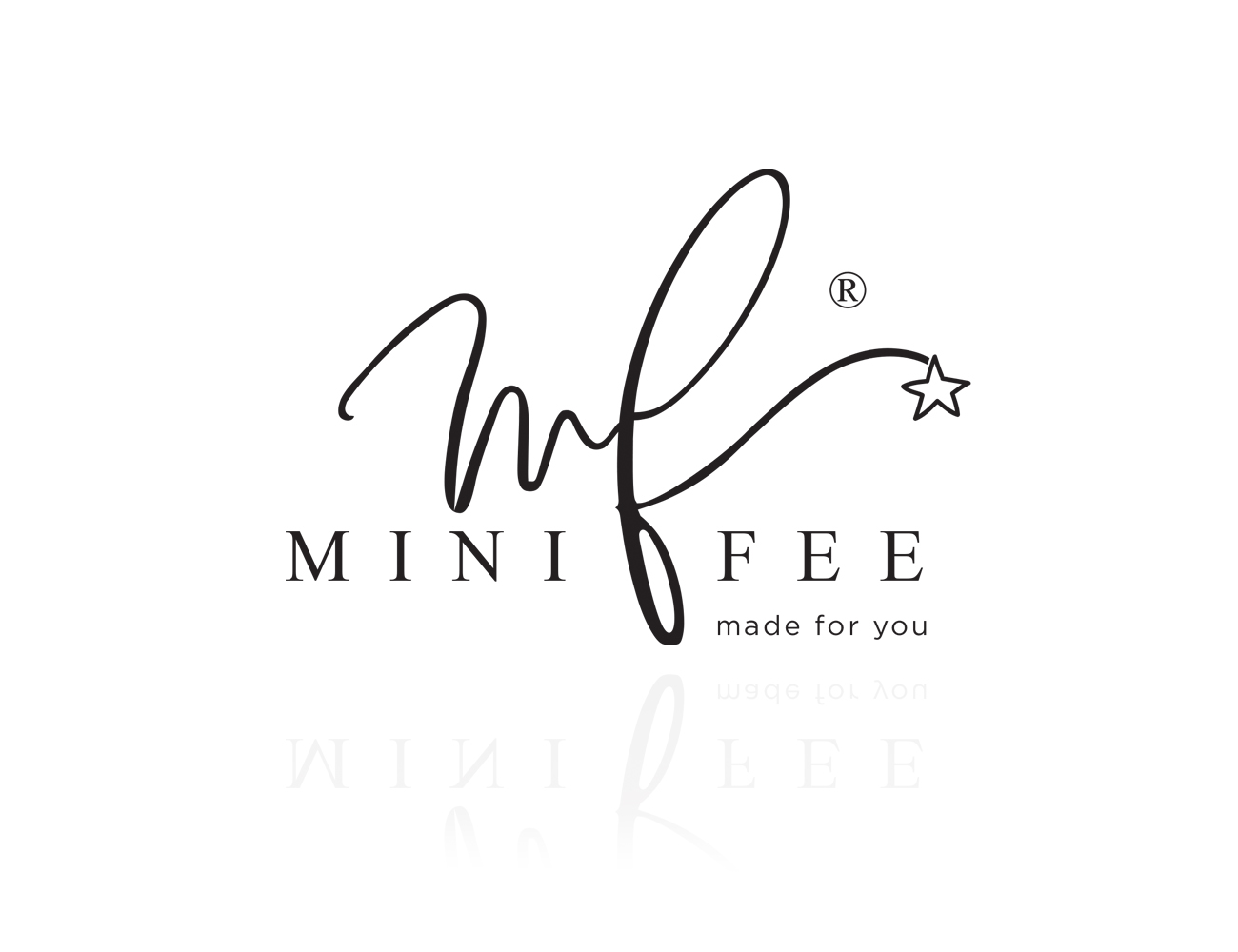
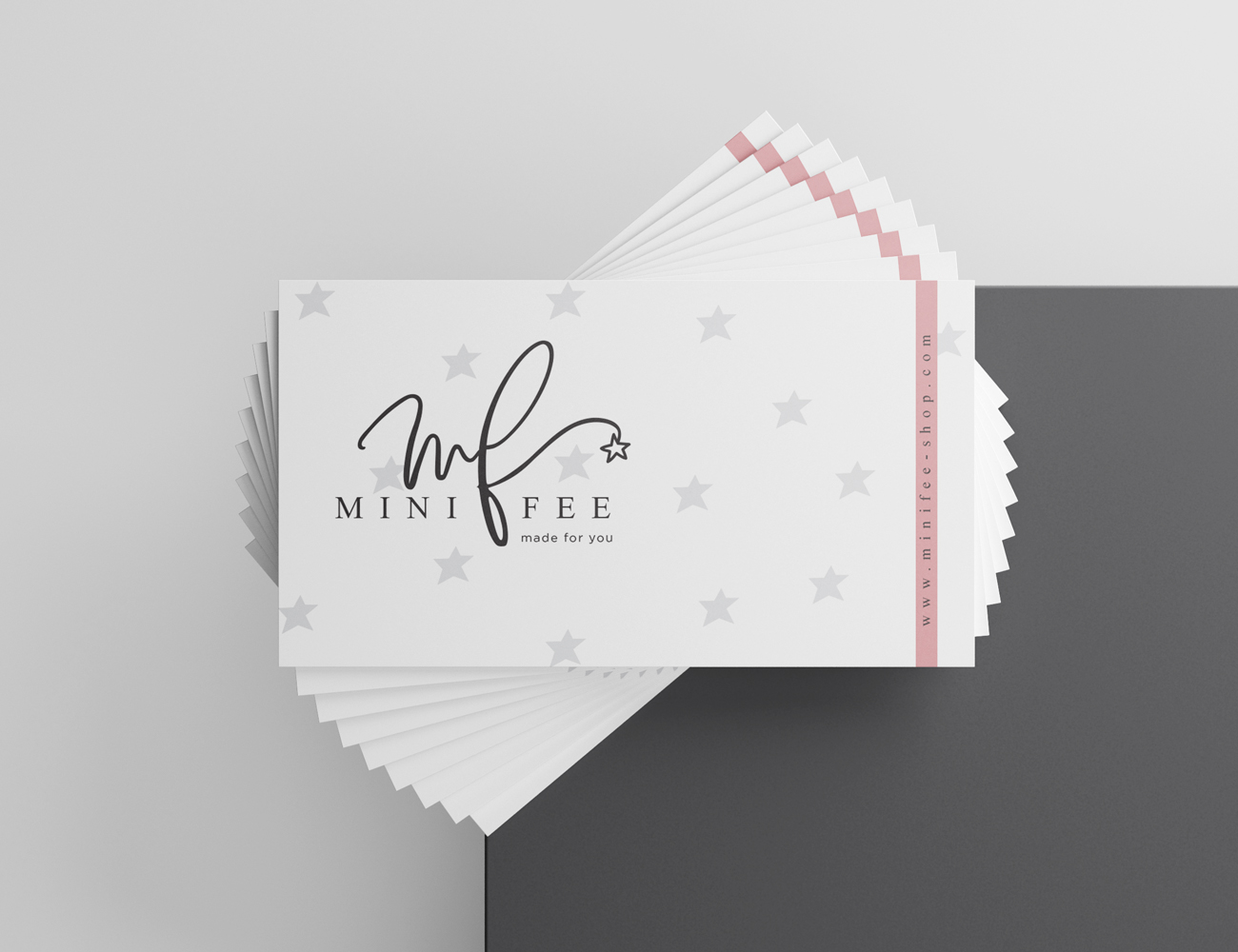
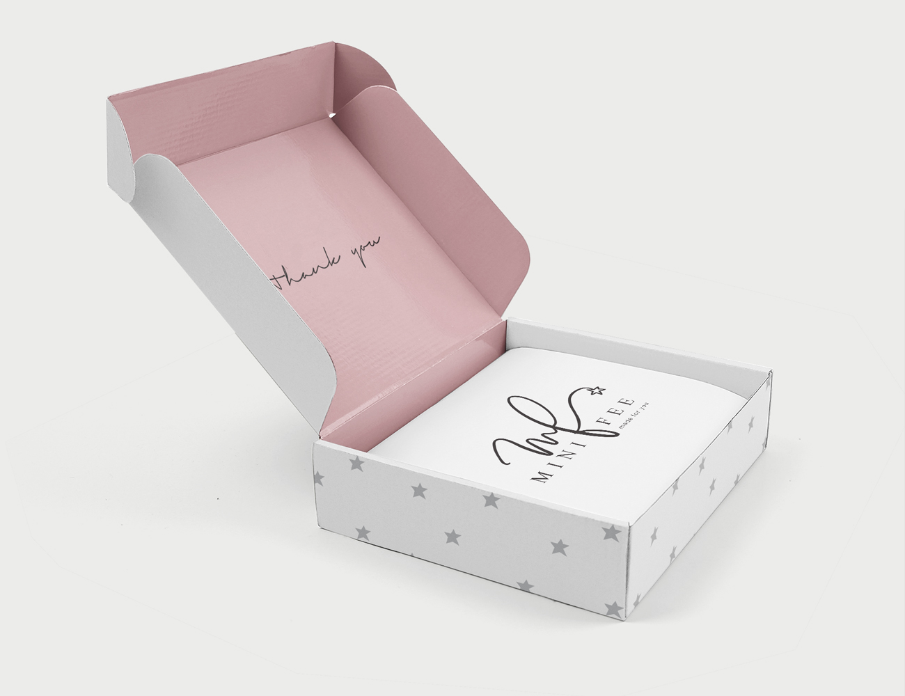
We combined the initial letter M and F in a more playful way, like it is created by the fairy’s stick, ending up like a magic wand. We chose pink as a secondary palette, a delicate color that means sweet, playful, cute, and is associated with babies.
Based on the logo and following a minimal structure, we designed the website and the packaging.
-

Mini Free Logo Redesign
-

Mini Free Web Design
-

Mini Free Brand Identity
-