NICTECH Branding
Logotype, Corporate Identity, Brochure, Branding
The briefing:
NICTECH Branding
Nictech, a new promising Internet provider assigned its Corporate Identity to our office.
The main aim of the design as a whole was to combine a greek element with a technological reference. That’s why as a trademark we designed the ancient theater symbol, the kernel, which also symbolizes the shape of the wireless network.
The dominant color is the dark blue, which is often associated with stability and trust.
-

Nictech Logo
-

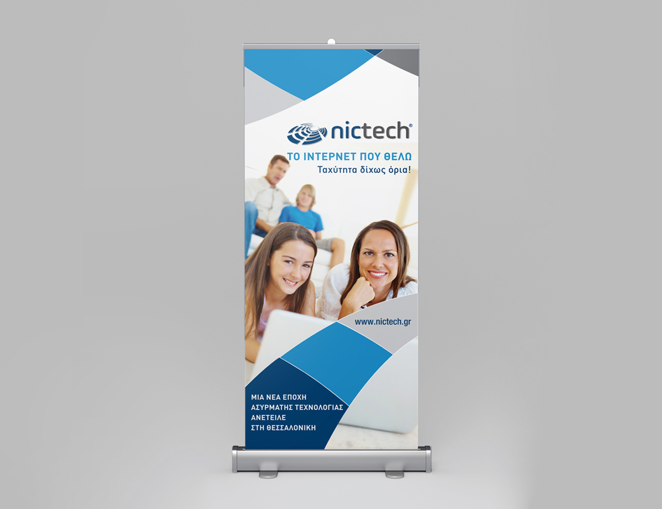
Nictech Brand Identity
-

Nictech Brand Identity
-

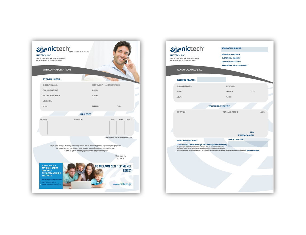
Nictech Brochure
-